I'm just going to be giving my opinion on your map submission, I hope you can take my constructive criticism into consideration! <3
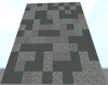
Firstly the build itself; build could be more detailed, rather than having stone walls try and incorporate some color into them, add bocks such as cyan stained clay (159:9) or andesite (1:5) to create some depth into the walls. Here's an example of adding color into the walls;
This is a random assortment of 40% andesite, 40% stained clay, and 20% stone merged together into the wall, it looks a lot better than just the stone, don't you think? However, we can go one step further to incorporate more detail and make sure we bump up the aesthetics of the walls themselves! Example here:
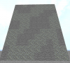
Utilizing the SIMPLEX pattern in FAWE, we can incorporate some neat patterns into our builds, also I took out the stained clay, as that created too much of a color discrepancy within the wall itself. With wall detailing. try to also add depth within the wall, create holes/pillars along the wall to ensure it looks good! Here's another example on the wall:
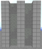
Adding pillars add structural depth to the build and make it seem as if they're being held up by supports, rather than just the wall itself, also personally they just seem cool haha! But again, you don't have to add the pillars, they're mainly just for aesthetic purposes (Honesty I love them as I love over detailing maps)
Again, adding detail to a map is important, ensuring the map looks nice and is detailed to ensure that the map isn't all the same color, really allows your map to come to life!
Next, let's move onto the theme itself on your map! From the looks of things, I can't see a distinctive theme within your map. I would recommend building your map around a theme that is identifiable and allows you to have a rough picture of your map before you build it, let me give an example;
Above is a spoiler that includes a picture of the San Telmo Palace in Seville, Spain! I really liked the look of the exterior of the building, so I decided to create it in Minecraft and incorporate it into a map! (The map name is Seville, /log Seville). Grasping an idea of what I wanted to build before I built it, allowed me to stay on course and build something with lots of vibrance, color, depth, and detail. In conclusion, come up with a theme before building, it will pay off in the long run, trust me <3
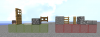
Last but not least, is the parkour section! Now, while the parkour of your map is technical, and fits what you were going after on your map, I will give some pointers to ensure your map parkour flows and feels nice to play on! Firstly, your parkour seems repetitive, although this is not a bad thing, maps on Manacube should have parkour that is varied, so jumps that include different hitboxes, for example:
The blocks on the left vary in hitbox size, and allow for more interesting parkour jumps to be created within a course. Next, the right side all have the same block hitbox and can be lacking in variance if used over and over within a map. So what I'm getting at, is to use a mixture of both, but ensure you're mainly utilizing blocks from the green glass side to ensure players find your map enjoyable and not boring!
A few final pointers for your map:
- Your map needs to end with a final pressure plate, otherwise players won't be able to finish and judges won't know where your map ends! Here's an example:
The end of your map should be a colored wool block (this matches the difficulty: Easy, Medium,Hard,Expert & Insane). After this, place a stone pressure plate on top, this will create the end of your map!
- Just a personal opinion, Redstone can often break on maps. so try to keep this to a minimum if you're thinking of using it throughout your map!
- Try to ensure that your map doesn't have any skips that skip long sections of the parkour or any for that matter. I found one skip that allows you to skip the entire button pressing section, here:
I'd recommend placing barriers on top of the walls or extending them upwards to ensure that players can't skip the map!
That's all! I hope you can take my points into consideration! If you'd like any more help you can always contact me here on the forums on I'm always replying to people in-game! Have a good one!
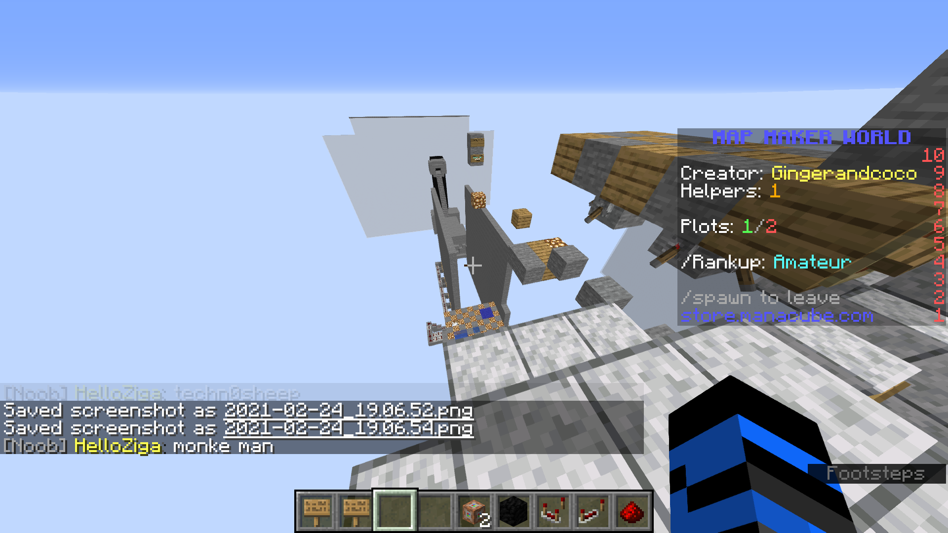
There really isn't a THEME to your map. Make sure you create a map around a base theme. The theme could be a character from your favorite video game or a scene from your favorite movie.
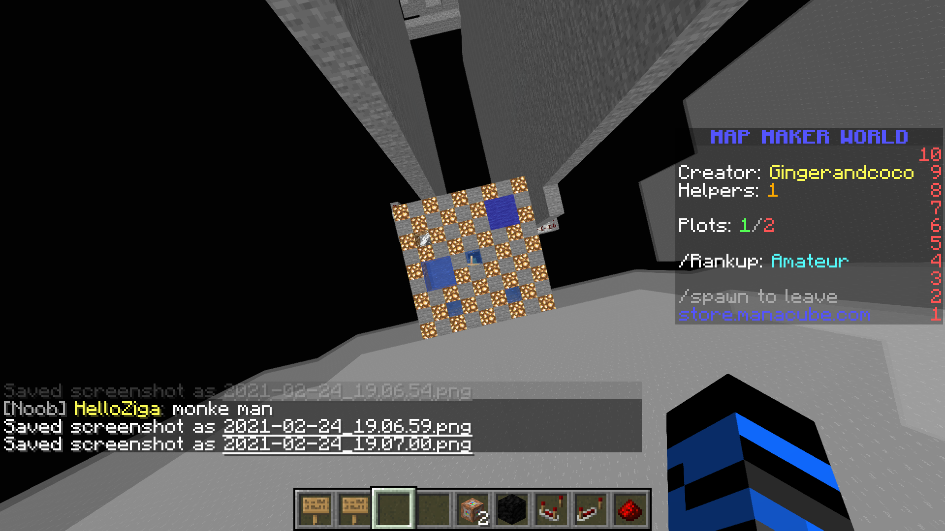
The BUILD of your map is a problem. There isn't a main build, it is just floating blocks and boxes. Next time try considering creating one main build with lots of depth and detail.
The PARKOUR fits the difficulty of a medium map, so good job on that! Your parkour is lacking variance, only things that are incorporated are regular jumps with red stone. To add more variance, try adding more jumps with unique blocks like pots, water, heads, vines, etc.
Thank you for taking the time to create a map, I hope to see more submissions from you in the future.
If you have any questions feel free to reach out to me on discord at Elly#5555
Elly
 544.7 KB Views: 68