Rejected Inside attempt 3 (insane)

Status
Not open for further replies.

DaWomboss

Active Member
Joined
Sep 30, 2021
Posts
48
Ratings
32 1
#1
Hi guys this is my third attempt at submitting this map. Last time I was flamed pretty badly for the walls hehe so yes i have done some interior renovations which hopefully bring this build up to standard.

I also made some changes to the parkour to make it more enjoyable. I hope you guys like it!
Thanks to Inktest and Doobix for helping out

Creators: DaWomby, Kvoidcoconut, Daaronaaronax, Pax_australis
Name: Inside
My second plot
Insane map

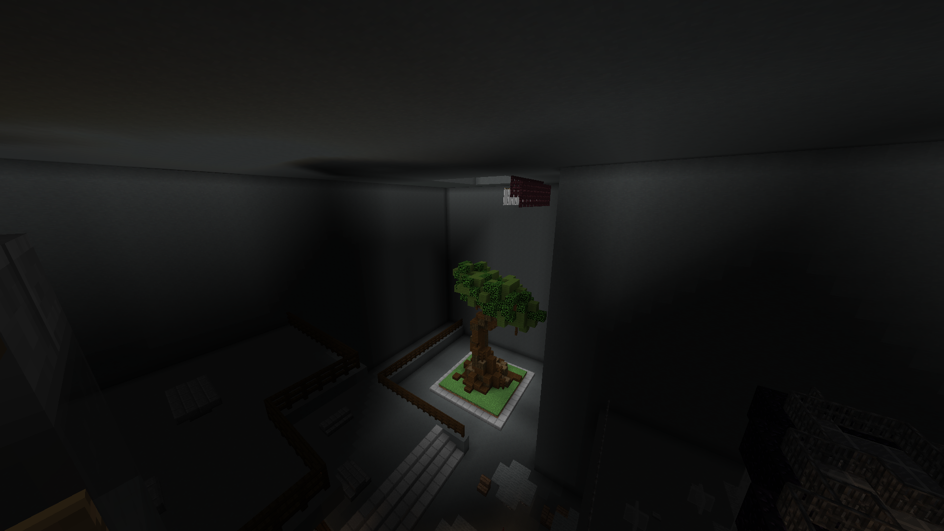
ALso, I have made a hidden room that is achievable in survival. I salute you if you can reach this legit.
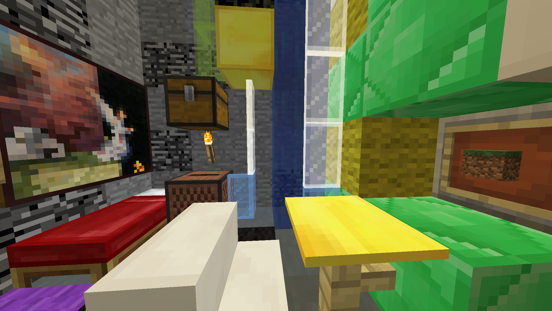
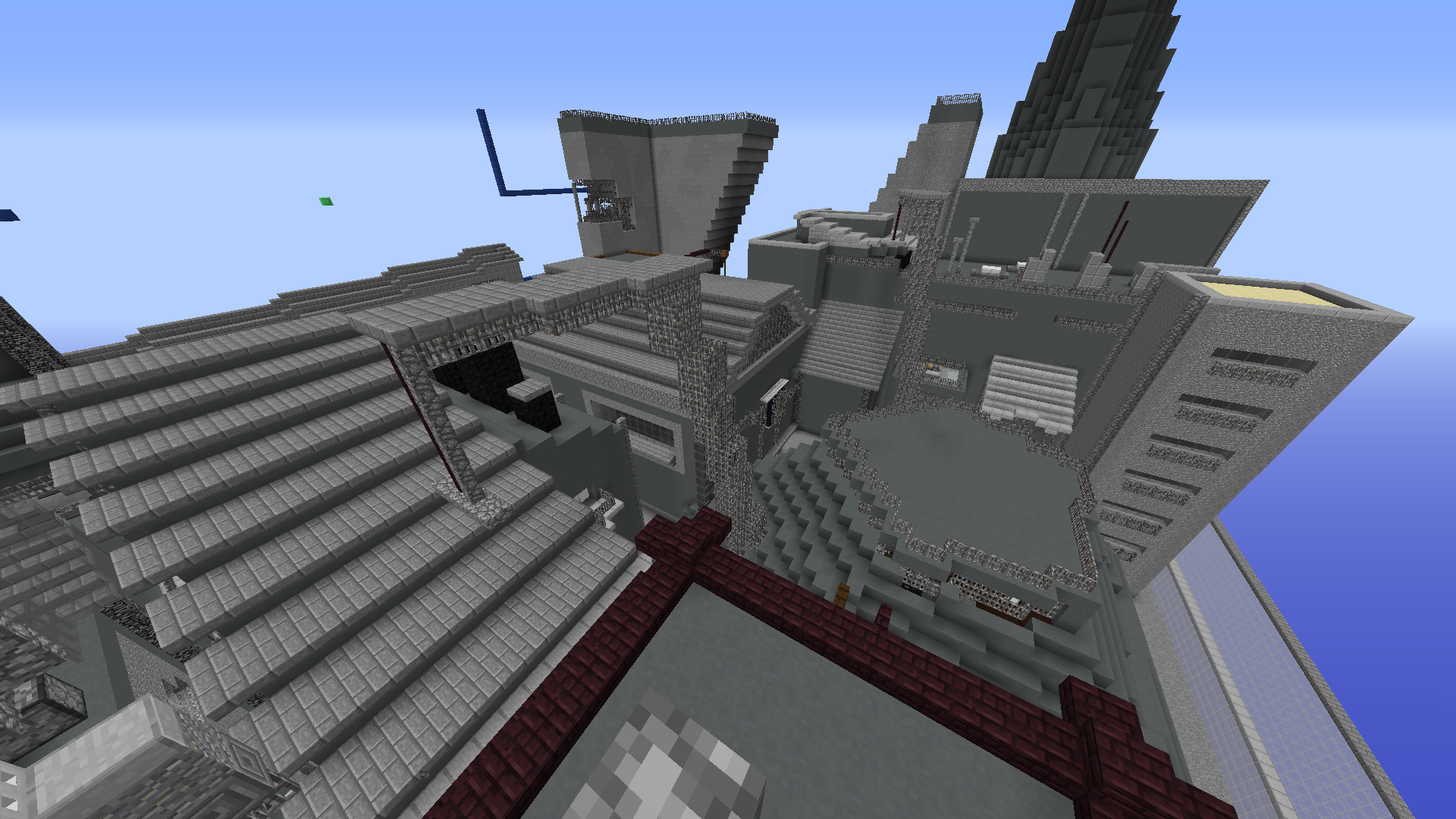
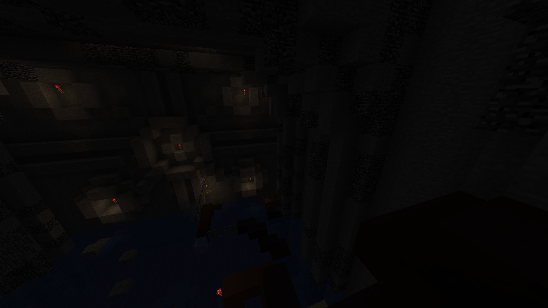
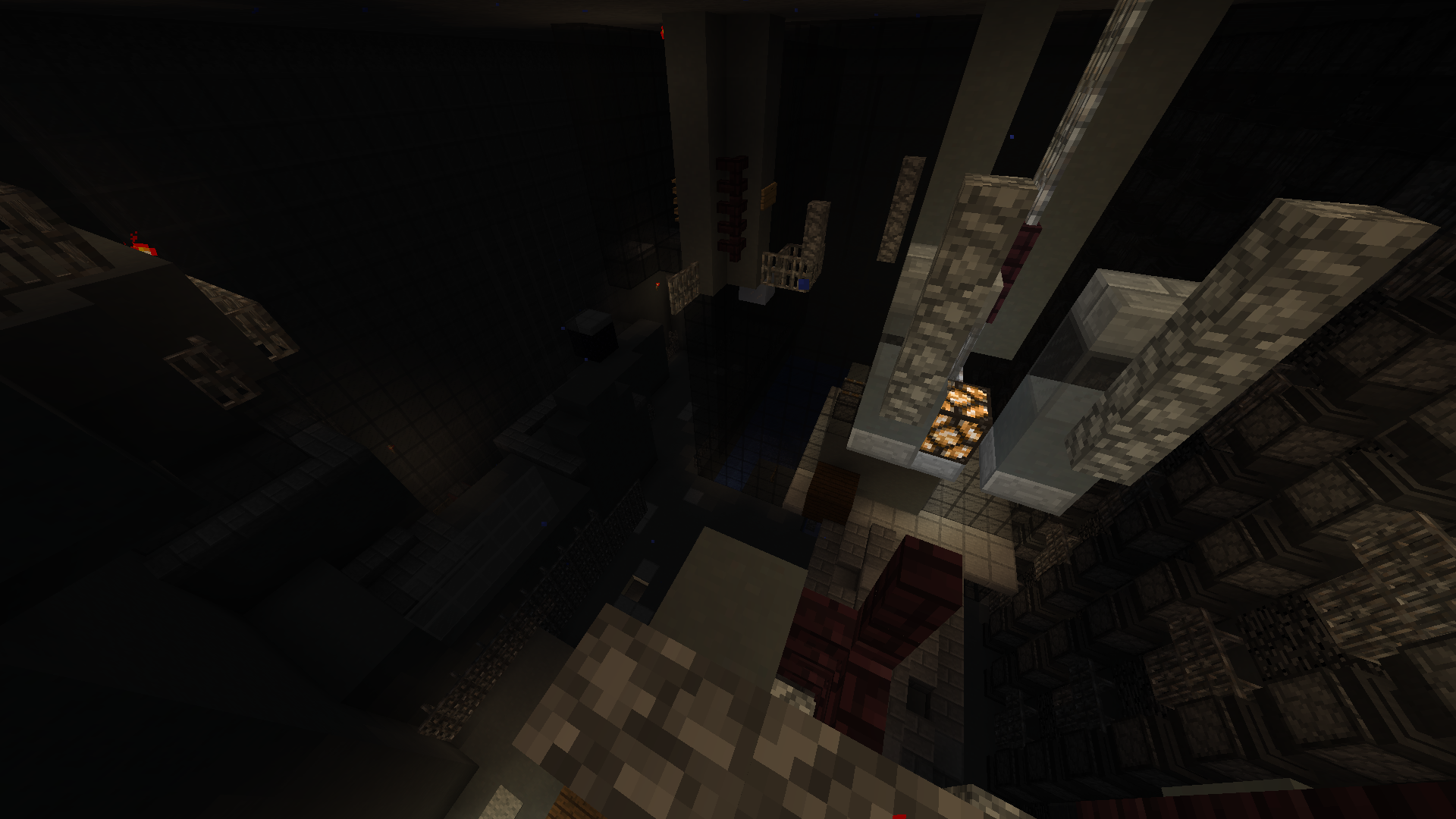
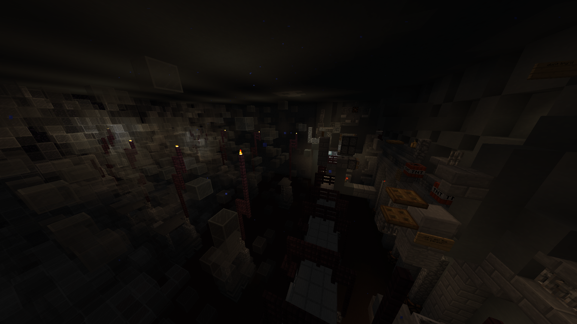
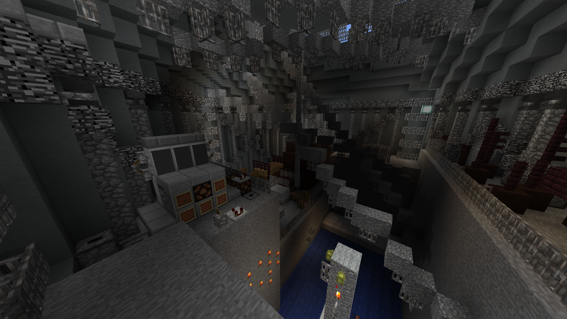
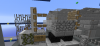
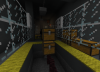
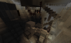
2022-01-04_18.19.38.png


Here are pics
2022-01-05_10.35.52.png
2022-01-05_10.36.29.png
2022-01-05_10.37.06.png
2022-01-05_10.39.21.png
2022-01-05_10.40.12.png


2022-01-05_10.36.49.png
 

fribe

Dedicated Member
ELITE
fribe
fribe
ELITE
Joined
Feb 8, 2017
Posts
203
Ratings
132 9
#3
3rd times the charm hopefully, best of luck!
 

Blurpyfied

Forum God
ELITE
Blurpyfied
Blurpyfied
ELITE
Joined
Jan 1, 2017
Posts
1,827
Ratings
960 435
#4
I may get flamed for this, but I don't really care.

I think the build needs MORE work, and when I mean by that, I think you should be adding some sort of other colors, other than a gray color, for example, some blue wool, maybe even diorite (even though thats the ugliest block in the game). Just this build to me, hasn't really been attractive, even though this is supposed to have a feeling like the game. You gotta have a build pop if you want it to be a map. Not just the inside (haha funny), but the outside as well.

I haven't tried the parkour yet, but I'll edit this and change my rating.


My rating will be a 0.
 

caseyclosed

Forum Expert
ELITE
caseyclosed
caseyclosed
ELITE
Joined
Feb 11, 2017
Posts
301
Ratings
518 24
#5
I may get flamed for this, but I don't really care.

I think the build needs MORE work, and when I mean by that, I think you should be adding some sort of other colors, other than a gray color, for example, some blue wool, maybe even diorite (even though thats the ugliest block in the game). Just this build to me, hasn't really been attractive, even though this is supposed to have a feeling like the game. You gotta have a build pop if you want it to be a map. Not just the inside (haha funny), but the outside as well.

I haven't tried the parkour yet, but I'll edit this and change my rating.


My rating will be a 0.

The original source material is monochromatic
 

Juandacun

Dedicated Member
ELITE
Juandacun
Juandacun
ELITE
Joined
Jul 11, 2015
Posts
107
Ratings
79 9
#6
Aight, ill give you some feedback in few aspects about the map.

The theme: I couldnt really find one, i understand its a facility from the signs you could find around the map but you already got some similar builds.
The build: Its not terrible, its actually pretty nice, even though it doesnt have an actual theme (personal opinion) it gives some Rankup vibes, and hey, thats pretty unique for Manacube. something id recommend is lightning the interior sections more and adding more texture to them, try using a //brush sphere with stuff like diorite or others and mask it to your clay structures, just to give it a more natural colour and something better than plain clay walls. The start section looks pretty cool imo.
The parkour: Here comes the issue, manacub doesnt really like hard parkour thats inconsistent and/or not easy to speedrun, and thats something your map has. I understand that whoever built the parkour is skilled at the game, but for average players, like me, sidestepping or doing some of the onejumps around the map was pretty difficult. With this, the checkpoint balancing on this map was terrible (being honest) some sections would take you alot of effort to go through and all of that without a near checkpoint, your map becomes easier and enjoyable if the sections or the checkpoints arent that long. Another slight issue was The pathing, id sometimes have to take a look around to search where i have to go, but thats not that big of a deal, just add some signs here and there explaining.

Weird momentum setup tbh
1641394446935.png

I didnt really understand the blip, personal opinion tho
1641395771172.png

I couldnt do this one
1641395876370.png

This onejump took me a while but hey , at least its fs
1641395971218.png

This entire section is l/d, not a huge fan of it
1641396050272.png

Z facing jam and all, but its pretty far into the checkpoint and can be a huge pain if you fail it

1641396115321.png

Nothing wrong with the jump, one suggestion i could give is that you should move the trapdoor 1 block back (towards the direction of the arrow), so you can use it without actually hitting the edge of it
1641396234663.png

Weird momentum setup again, maybe specify the timing
1641396269865.png

Same thing here, prob only posssible in survival? couldnt really test it
1641396324759.png
w
Why- we all know thats a terrible paneup
1641396359161.png

Also add a sign here telling people where to go, i got confused
1641396407163.png

Backwalled as well? :sob:
1641396465895.png

Really struggled on this one, maybe add a trapdoor next to the carpet so its easier to land?
1641396533148.png

Add a sign here telling people to climb back up
And other stuff i could mention but im too lazy to do it.

Conclusion: Give your build more colours besides gray clay, optimize your gameplay, meaning that you should nerf some jumps and do a better cp balancing.
 

Attachments

Dooble

Dedicated Member
QA Team
doobix
doobix
QA Team
Joined
Mar 20, 2018
Posts
212
Ratings
246 9
#7
i loved it before and i still love it now

gl
 

DaWomboss

Active Member
Joined
Sep 30, 2021
Posts
48
Ratings
32 1
#8
Aight, ill give you some feedback in few aspects about the map.

The theme: I couldnt really find one, i understand its a facility from the signs you could find around the map but you already got some similar builds.
The build: Its not terrible, its actually pretty nice, even though it doesnt have an actual theme (personal opinion) it gives some Rankup vibes, and hey, thats pretty unique for Manacube. something id recommend is lightning the interior sections more and adding more texture to them, try using a //brush sphere with stuff like diorite or others and mask it to your clay structures, just to give it a more natural colour and something better than plain clay walls. The start section looks pretty cool imo.
The parkour: Here comes the issue, manacub doesnt really like hard parkour thats inconsistent and/or not easy to speedrun, and thats something your map has. I understand that whoever built the parkour is skilled at the game, but for average players, like me, sidestepping or doing some of the onejumps around the map was pretty difficult. With this, the checkpoint balancing on this map was terrible (being honest) some sections would take you alot of effort to go through and all of that without a near checkpoint, your map becomes easier and enjoyable if the sections or the checkpoints arent that long. Another slight issue was The pathing, id sometimes have to take a look around to search where i have to go, but thats not that big of a deal, just add some signs here and there explaining.

Weird momentum setup tbh
View attachment 56525
I didnt really understand the blip, personal opinion tho
View attachment 56526
I couldnt do this one
View attachment 56528
This onejump took me a while but hey , at least its fs
View attachment 56529
This entire section is l/d, not a huge fan of it
View attachment 56531
Z facing jam and all, but its pretty far into the checkpoint and can be a huge pain if you fail it

View attachment 56533
Nothing wrong with the jump, one suggestion i could give is that you should move the trapdoor 1 block back (towards the direction of the arrow), so you can use it without actually hitting the edge of it
View attachment 56535
Weird momentum setup again, maybe specify the timing
View attachment 56536
Same thing here, prob only posssible in survival? couldnt really test it
View attachment 56537 w
Why- we all know thats a terrible paneup
View attachment 56538
Also add a sign here telling people where to go, i got confused
View attachment 56539
Backwalled as well? :sob:
View attachment 56540
Really struggled on this one, maybe add a trapdoor next to the carpet so its easier to land?
View attachment 56541
Add a sign here telling people to climb back up
And other stuff i could mention but im too lazy to do it.

Conclusion: Give your build more colours besides gray clay, optimize your gameplay, meaning that you should nerf some jumps and do a better cp balancing.
I probably should have mentioned this but the map is based on a game called "Inside". I probably am not going to add more "colour" to the build because it simply is not meant to look like that. Sorry : / I can't have random texture for nothing given I have already made the builds way more detailed than how they are in-game. I dont wanna stray too far.

I will add the directional signs ty for telling me.

As for the parkour though, I have disagree on a few of the jumps you mentioned, because for several of them I honestly don't find them very difficult at all.

As for the chest neo with the trapoors, I will change that.

I will go and try to make the difficulty more consistent, and I have always tried to maintain around 7-10 l/d jumps in a checkpoint and tried making it fair, and I think from my perspective given i am the creator its different to someone who isnt, so its good to get input from other people. Do you in particular have any parts you feel are too easy/hard compared to the rest of the map?

Finally, you do not have to worry as there are only 2 jumps i recall that a sidestep is really necessary. I assumed sidesteps were allowed because I had encountered one on this insane map I played called Glitchtrap. I don't know how it works here, but I want to onejumps to feel like their own section, instead of just one free jump to throw away, which is why I make them so that they will take a bit of time.

Thanks for the help
 

BluePottwal

Dedicated Member
ELITE
BluePottwal
BluePottwal
ELITE
Joined
May 2, 2020
Posts
216
Ratings
164 12
#9
i just tested the map and i have to give you a clear -1.
The outside build is pretty good and you can see that some effort went into it.
The inside build is a complete chaos: -No interior design, -no lighting. You can literally see that there went below than 0 effort into the interior design. Overall it is empty. So buildwise it does not fit the standard of manacube insanes.
The parkour has some good parts. I actually like the jump concepts. Some nerfs may be required for some of the jumps that Juan mentioned above. Overall the parkour felt unbalanced and therefore unenjoyable. Furthermore, there are many skips on your map that would need to be patched.
As for the parkour, you said that you didnt find them too hard. You have to consider, that the people playing that map arent all super good at parkour. (And btw Glitchtrap has no sidesteps :))
 

Blurpyfied

Forum God
ELITE
Blurpyfied
Blurpyfied
ELITE
Joined
Jan 1, 2017
Posts
1,827
Ratings
960 435
#10

DaWomboss

Active Member
Joined
Sep 30, 2021
Posts
48
Ratings
32 1
#12
i just tested the map and i have to give you a clear -1.
The outside build is pretty good and you can see that some effort went into it.
The inside build is a complete chaos: -No interior design, -no lighting. You can literally see that there went below than 0 effort into the interior design. Overall it is empty. So buildwise it does not fit the standard of manacube insanes.
The parkour has some good parts. I actually like the jump concepts. Some nerfs may be required for some of the jumps that Juan mentioned above. Overall the parkour felt unbalanced and therefore unenjoyable. Furthermore, there are many skips on your map that would need to be patched.
As for the parkour, you said that you didnt find them too hard. You have to consider, that the people playing that map arent all super good at parkour. (And btw Glitchtrap has no sidesteps :))

Hi can you tell me what parts you found too unbalanced? Ill go fix them.

Also, im really sorry but im not adding more lighting to the build as whats here is necessary already. Lighting would ruin the vibe of the build and only accentuate the empty problem.

I get that my skill level is different to others, but those aformentioned jumps were in my opinion easier than many other jumps on the map, which is why I was so confused in to why they were so insanely hard. Can you tell me which jumps in particular you found too hard? And ill consider giving them a nerf.

Ty
 

carvhes

Dedicated Member
ELITE
carvhes
carvhes
ELITE
Joined
Sep 13, 2021
Posts
142
Ratings
78 3
#13
I could probably write a lot about this map, but DaWomby knows I generally dislike this map. I think a part of it is the open space. I know its intentional, but I just don't like it. Other people put it better than me, and I really shouldn't be talking about insane parkours cause I only have completed one insane, but I give this a -1. I wouldn't like to see this become a map IMO.
 

WolfAndRyan

Active Member
ELITE
WolfAndRyan
WolfAndRyan
ELITE
Joined
Dec 16, 2017
Posts
38
Ratings
16
#14
To be honest, I think most reviews is not really on point. They said a lot about the interior design is bad or the parkour is bland, but I don't think that's the main issue. What I really think the main issue is:
TOO MANY FLOATING PARKOUR!!!

Outside the river: Floating Parkour.
Inside the House: Partly Floating Parkour.
Outside the House: Floating Parkour.
Inner City: Oh God, This part is all Floating Parkour.
Inside the sewer: All the way is Floating Parkour.
......

I think you get the idea. The parkour is separate from the build, which makes so many people feels the build is blend and the design is bad. At this point, your build doesn't matter anymore. When I am playing this map, I feel like I am playing a old 1.5.2 parkour map. It's very boring and not fun to play.

There are so many potential of this map, but I think you messed it up. Like this room for example:

2022-01-10_21.15.22.png


Instead of using the smoke, you are build floating parkour at the side of the room. Like...... WHAT??? This room isn't the worst though. Take this room as an example:

2022-01-10_21.25.38.png


I really don't understand your thinking process when building this room's parkour. This is such a big room and you are just build a pillar of parkour...... This is just hilarious and make me laugh out loud! There are so many room that is empty and you are just building the parkour at the wall. What a Waste!!!

Let me get this straight, I am not a mapper nor a map judge. But a player that gives out my honest feeling while playing the map. You can think that my opinion is BS, but I think most playing don't want to play an insane map like this and would just pearl to the end.

Try to make the parkour blend into the build! That would be my advice for the map.
 

Tas

Member
ELITE
ManaLabs
ManaLabs
ELITE
Joined
Nov 2, 2017
Posts
1,620
Ratings
1,315 43
#15
To be honest, I think most reviews is not really on point. They said a lot about the interior design is bad or the parkour is bland, but I don't think that's the main issue. What I really think the main issue is:
TOO MANY FLOATING PARKOUR!!!

Outside the river: Floating Parkour.
Inside the House: Partly Floating Parkour.
Outside the House: Floating Parkour.
Inner City: Oh God, This part is all Floating Parkour.
Inside the sewer: All the way is Floating Parkour.
......

I think you get the idea. The parkour is separate from the build, which makes so many people feels the build is blend and the design is bad. At this point, your build doesn't matter anymore. When I am playing this map, I feel like I am playing a old 1.5.2 parkour map. It's very boring and not fun to play.

There are so many potential of this map, but I think you messed it up. Like this room for example:

View attachment 56736

Instead of using the smoke, you are build floating parkour at the side of the room. Like...... WHAT??? This room isn't the worst though. Take this room as an example:

View attachment 56737

I really don't understand your thinking process when building this room's parkour. This is such a big room and you are just build a pillar of parkour...... This is just hilarious and make me laugh out loud! There are so many room that is empty and you are just building the parkour at the wall. What a Waste!!!

Let me get this straight, I am not a mapper nor a map judge. But a player that gives out my honest feeling while playing the map. You can think that my opinion is BS, but I think most playing don't want to play an insane map like this and would just pearl to the end.

Try to make the parkour blend into the build! That would be my advice for the map.
It’s a big build, if he filled it up with parkour it would be 300 jumps and cramped. Also whats wrong with floating parkour ?
 

caseyclosed

Forum Expert
ELITE
caseyclosed
caseyclosed
ELITE
Joined
Feb 11, 2017
Posts
301
Ratings
518 24
#16
To be honest, I think most reviews is not really on point. They said a lot about the interior design is bad or the parkour is bland, but I don't think that's the main issue. What I really think the main issue is:
TOO MANY FLOATING PARKOUR!!!

Outside the river: Floating Parkour.
Inside the House: Partly Floating Parkour.
Outside the House: Floating Parkour.
Inner City: Oh God, This part is all Floating Parkour.
Inside the sewer: All the way is Floating Parkour.
......

I think you get the idea. The parkour is separate from the build, which makes so many people feels the build is blend and the design is bad. At this point, your build doesn't matter anymore. When I am playing this map, I feel like I am playing a old 1.5.2 parkour map. It's very boring and not fun to play.

There are so many potential of this map, but I think you messed it up. Like this room for example:

View attachment 56736

Instead of using the smoke, you are build floating parkour at the side of the room. Like...... WHAT??? This room isn't the worst though. Take this room as an example:

View attachment 56737

I really don't understand your thinking process when building this room's parkour. This is such a big room and you are just build a pillar of parkour...... This is just hilarious and make me laugh out loud! There are so many room that is empty and you are just building the parkour at the wall. What a Waste!!!

Let me get this straight, I am not a mapper nor a map judge. But a player that gives out my honest feeling while playing the map. You can think that my opinion is BS, but I think most playing don't want to play an insane map like this and would just pearl to the end.

Try to make the parkour blend into the build! That would be my advice for the map.
Floating parkour isn't really an issue. Structure builds are different beasts in terms of mapmaking, and this is a very large structure build. I'm in agreement with Tas here, did you want him to cramp 300 jumps into this map?

You also mention that parkour should blend into the build but this is not what you want with a structure build. It should be a mostly clear route.

Also side note, I don't know why people are complaining about the interior. I think it looks really cool. Especially the two rooms shown in WolfAndRyan's post
 

DaWomboss

Active Member
Joined
Sep 30, 2021
Posts
48
Ratings
32 1
#17
Guys im hearing a few recurring themes here so let me just say a few things.

I purposely made the build have lots of open space because its meant to be like that. It's supposed to look really big and ominous, which is also why I didn't add much lighting. If you want to see what i'm aiming for look at the source material.

You guys have given me good advice with the parkour and I'm actively working on it.

And yes you are right that I am holding back in interior design. I simply do not want to make the build to be too ostentatious to compare to the source material which is already super bland. In my opinion i've already made it much more full than in the game and I honestly think it's enough. You may disagree but fixing it really is not as simple as just going "add more deco bruh" or "add color".

Maybe one thing to consider is that I see a lot of people have gamma 10 when looking through which does make the empty bits really pop out when they otherwise should just be a shadow.

For example, here is one of the scenes that I built.


1641853436963.png

You can see everything I added was done on the fly. I get the build needs to look good, but how much are you willing to stray to achieve that? I'd rather keep it at a minimum.
 

WolfAndRyan

Active Member
ELITE
WolfAndRyan
WolfAndRyan
ELITE
Joined
Dec 16, 2017
Posts
38
Ratings
16
#18
It’s a big build, if he filled it up with parkour it would be 300 jumps and cramped. Also whats wrong with floating parkour ?
I'm not saying that it should have like 300 jumps. But quite the opposite. He's building too many parkour in a wrong way. Take these two rooms as an example:

2022-01-10_21.25.38.png


2022-01-11_09.23.17.png


He is building so many parkour in a empty room, but only build a pillar of parkour in a room with that has many interior design. Do you understand the different between them?

As you mentions, since it is such a big build, I don't think it is necessary to like mash too many parkour in every room of the map. But he should be reasonably distributing the parkour. I think he should be putting more parkour in rooms that have more interior designs and making less parkour in such an empty room.
 

DaWomboss

Active Member
Joined
Sep 30, 2021
Posts
48
Ratings
32 1
#19
I'm not saying that it should have like 300 jumps. But quite the opposite. He's building too many parkour in a wrong way. Take these two rooms as an example:

View attachment 56765

View attachment 56766

He is building so many parkour in a empty room, but only build a pillar of parkour in a room with that has many interior design. Do you understand the different between them?

As you mentions, since it is such a big build, I don't think it is necessary to like mash too many parkour in every room of the map. But he should be reasonably distributing the parkour. I think he should be putting more parkour in rooms that have more interior designs and making less parkour in such an empty room.
Yea the reasoning for this, is that the first room you mentioned was intended to be a transition room which is why I only added a half-assed parkour there. In the actual game (which i tried my best to follow) this section consists of nothing but the player climbing up a vertical chain and moving on so I tried to replicate that with the tower.
 

<Inktest>

Forum Expert
ELITE
Inktest
Inktest
ELITE
Joined
Nov 22, 2019
Posts
275
Ratings
228 6
#20
I'm not saying that it should have like 300 jumps. But quite the opposite. He's building too many parkour in a wrong way.
He is building so many parkour in a empty room, but only build a pillar of parkour in a room with that has many interior design. Do you understand the different between them?
Imma say this.

Even "empty rooms" can be detailed, refering to the "Inside" theme, there are blank rooms where there is close to no decoration, which can be built in minecraft fairly well, the empty rooms are part of the theme.

Also why don't we start rating a bit more by the quality of the parkour instead of rating parkour by how well it is integrated into the build, whether you would have done X because if you do Y then you're not giving attention to this one side of the build?

I will also mention that there are different styles of building parkour, no one is going to say my maps are good because my pk style is extremly differnt to Kub's style. Same happens with this map, compact parkour, not to be confused with cramped parkour, is a different style. Sure it hasn't been used a lot in Manacube, but that doesn't mean it can't be done.

Note that I'm not saying the parkour built is good or bad, refering to quality of it, because I haven't played it.
 
Status
Not open for further replies.